HOME
HOME
ABOUT
ABOUT
WORKS
WORKS
CONTACT
CONTACT

Fibre Broadband

Online Subscription Revamp

Revamp Objective

SmarTone Fibre Broadband aim to provide user the ultrafast broadband service. The main objective of the revamp is to increase the supplier from 1 to 3. At the same time, my roles in this revamp project is to find out the pain points to improve the whole subscription progress also target to increase the conversion rate.

Research

Base on the requirement, the first thing we need to do is research. We decide on two different types of research. Firstly arrange a usability testing through the tool "look back", secondly study the existing data funnel try to define the pain point.

User Research

According to the "Lookback" result, user visited the main page and spend a lot of time studying the journey. Also don't know how to use the address search bar. Some user feedback on non-clear content & difficult to found relative information. Around 30% of user look for the service pricing but they even not succeed to finish the search address coverage task.

Summary & Suggest
1.) Improve address bar experience
2.) Restructure the landing page content
3.) Balance business & user requirement

Data Research

We using Google Analytics to keep checking on the performance of the funnel. From the funnel data, we can easy to review which step of the funnel with a higher drop-off rate. After we study on different periods of data we found out from the registration step to the review step with a high drop-off rate of around 90%. Moreover, the address bar search to plan selection with more than 35% drop-off. After review the user flow we define one of the main issues that cause the drop-off. Users required to fill with mobile numbers to finish OTP identification before filling in registration information. This factor should be solved at this revamp.

Summary & Suggest
1.) OTP (Main roadblock for user)
2.) Plan Card redesign
3.) Plan Summary Card

Ideate

Address bar

Existing address search required user input full address also too many trigger point of address bar easy to make confusion to user. The main idea is to make the search journey step by step. User input address first then select the floor & unit return back from address database. Also will adjust the address search trigger point from the landing page section.

Identify customer type

Before the revamp we used the OTP to identify customer type. But that mobile OTP was a roadblock to user. So we come up with a behind-identify customer concept. For new/existing customers both will input the mobile number field then will keep up input other personal info fields at the same time we will check the mobile number behind if found out the mobile number is an existing customer we will notify user if not they will not experience any roadblock.

Plan Summary Card

One of the main business value is add-on optional services. So the price may be unclear through the whole subscription progress. The summary card will list out the price & plan break down, provide traceback from the registration & review step. Aim to improve the drop-off rate at the review step.

Flow Chart

Base on the idea, we created wireframe and flowchart to present the whole user journey. Starting from landing page trigger different enter points to address coverage search. Also the plan & add-on service selection etc

Prototype

Base on flow chart, we also create the prototype let developers & product owner more easy to understand the final outcome.
Click the below Landing page to visit the Prototype.

Improvement

Funnel data to review & improvement
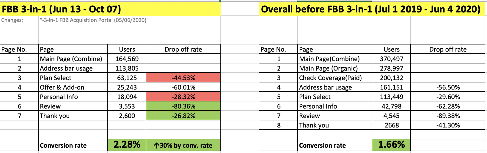
Above GA funnel data show the before & after of project revamp improvement. First we can look at the conversion rate, after the revamp we have over 0.5 % improvement. Also we can review the drop-off rate step by step. From the "Personal Info" step to "Review" step we have around 9% improvement. "Review" step to "Thank you" step we have over 23% improvement.

Honestly, we have some step didn't performed better than the old design. For example, over 72% of users drop off from "Plan Selection" to "Personal Info". So we keep updating the data also try to found out the issues. After some internal discussion, we made some hypotheses the reason. We have more add-on optional items in the "Offer & add-on" section and the horizontal plan card design may with too much empty space area. Those two factors may affect user's view plan & produce confusion. So we go into UX loop to define problem again and keep fixing different issues after the service launch.