HOME
HOME
ABOUT
ABOUT
WORKS
WORKS
CONTACT
CONTACT

Reef Link

"It’s not too late to save our reefs."
2025
Research
User Research
Persona
Key Insights
Design
Wireframe
Prototype
User Interface
Testing
User Testing
Finding

Overview

About
This UX case study is the final design project in my Interaction Design degree at QUT. ReefLink is a gamified mobile experience designed to reconnect young Australians with coral conservation through everyday sustainable habits. By transforming small eco-friendly actions—such as taking shorter showers or choosing reusable cups—into rewardable “Coral Points,” the app turns environmental responsibility into an engaging mission.

Users can spend their earned points to in partner restoration programs on the Great Barrier Reef. ReefLink makes the impact visible and personal through animated coral characters, a Coral Garden collection system, and educational storytelling that reveals the real threats affecting reef ecosystems.

Design Process

User Research
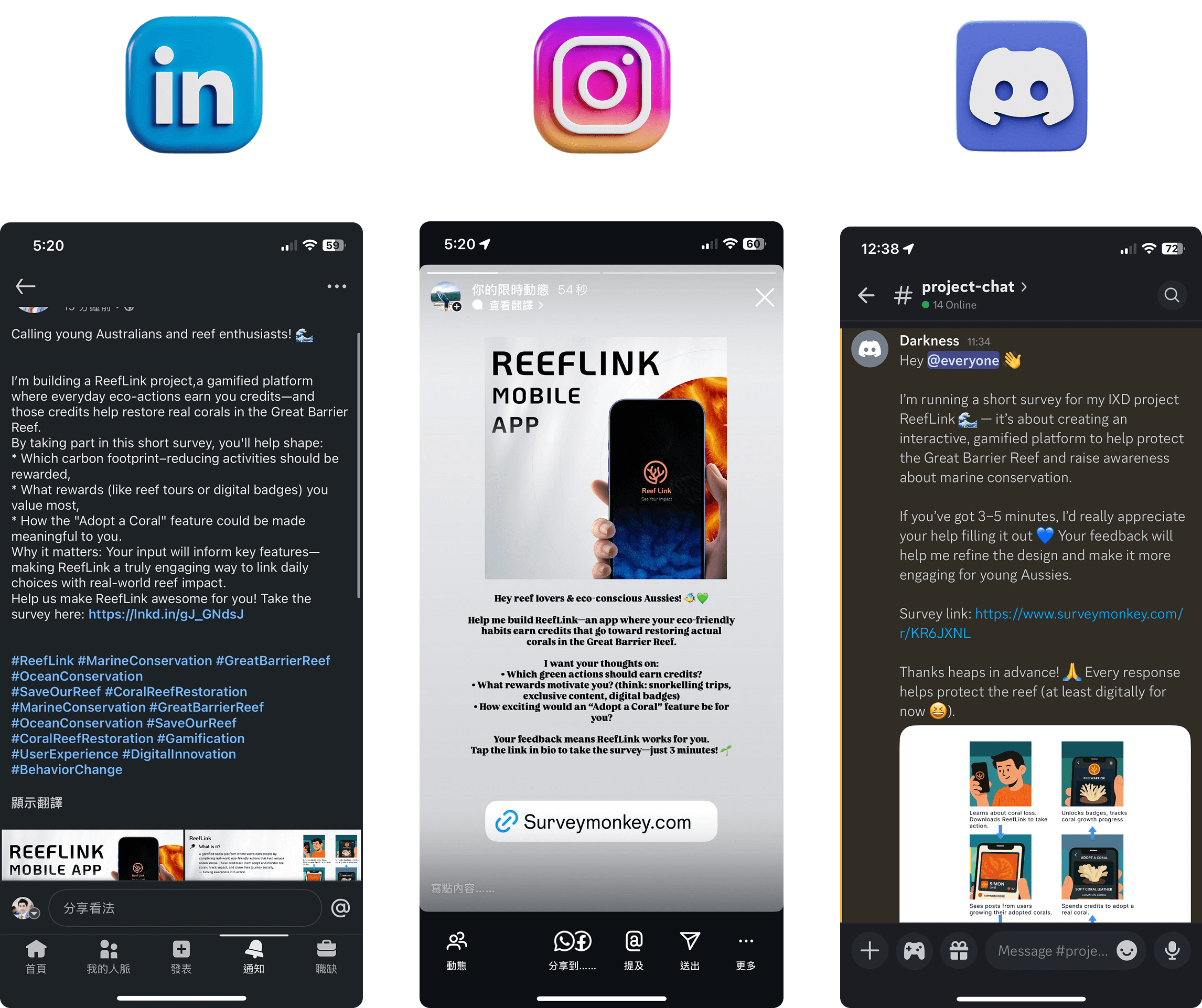
I conducted a user survey to gather early-stage insights from young Australians and domestic tourists about their motivations, interests, and expectations regarding eco-friendly behaviours and coral adoption. Distributed via social platforms including LinkedIn, Instagram, and Discord, the survey collected 17 valid responses with a 100% completion rate. The findings helped me better understand user awareness of carbon-reduction programs, willingness to take sustainable actions for rewards, and what types of incentives are most motivating — informing key feature directions for ReefLink.
Persona
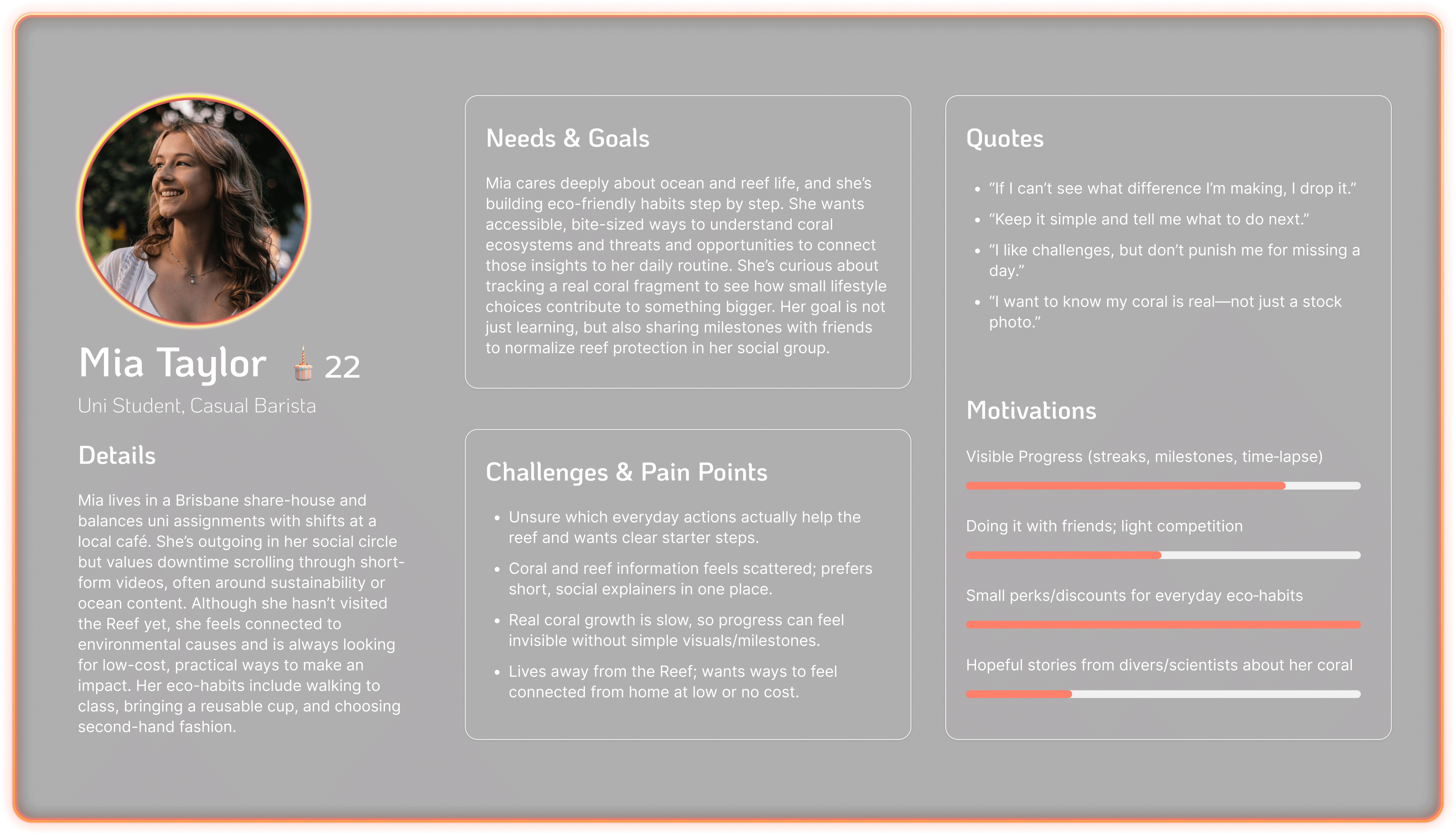
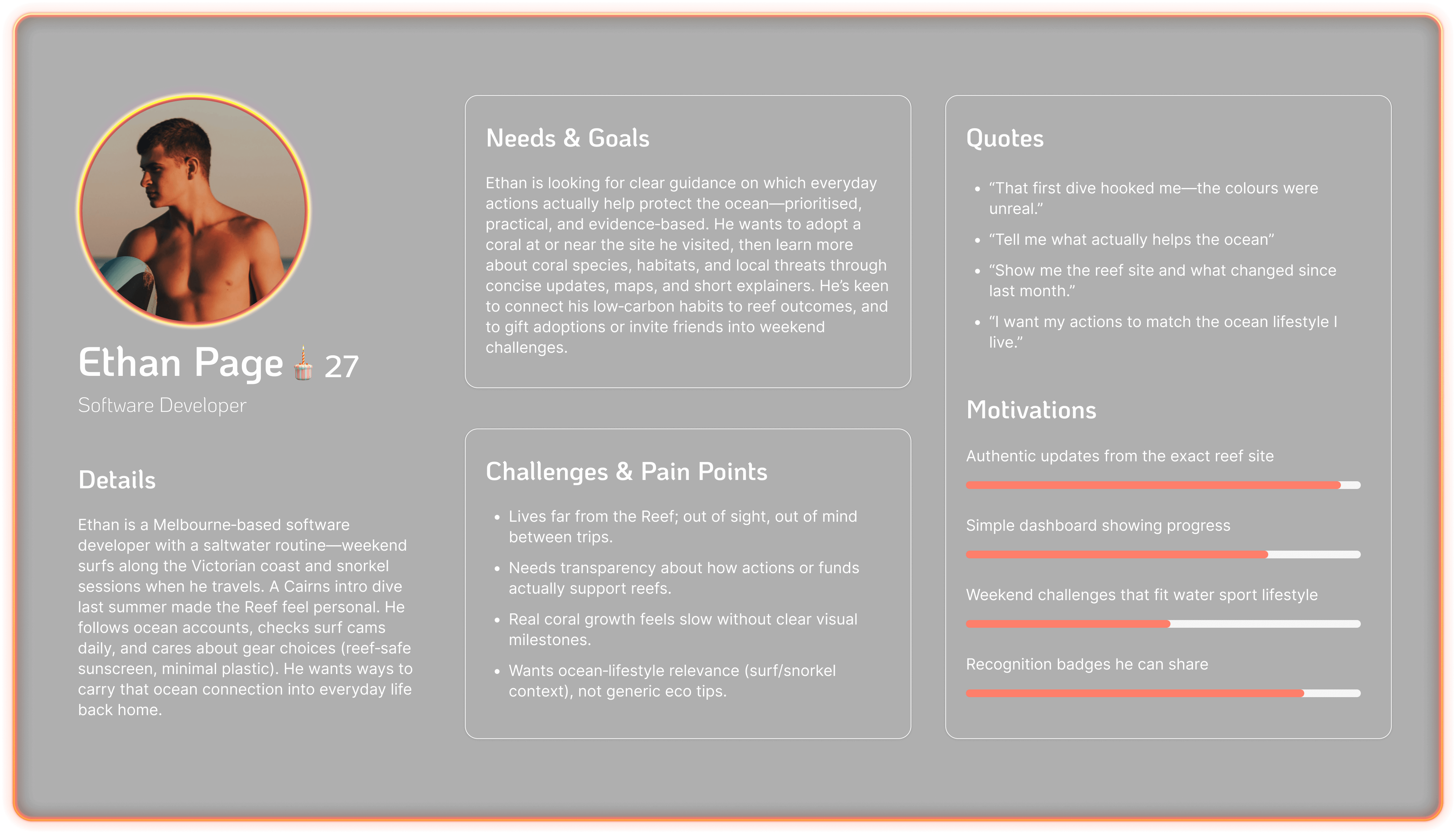
To better understand the needs and motivations of ReefLink’s core audience, I synthesised survey insights with secondary environmental-behaviour research to craft two primary user personas. These personas represent:

1:  Young Australians who care about the reef but have not yet experienced it in person
2:  Domestic tourists who have visited and developed a personal emotional connection to the Great Barrier ReefEach persona highlights unique goals, emotional drivers, and challenges related to adopting sustainable habits and supporting reef protection. These insights guided experience decisions such as how progress should be visualised, what rewards feel meaningful, and how to keep motivation strong over time.
Key Insights
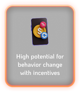
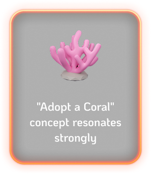
Research showed that users are highly motivated when they can:
1. Earn rewards for sustainable actions
2. Adopt and track a real coral they personally support
3. See visible impact and progress over time
4. Stay engaged through social and gamified experiences
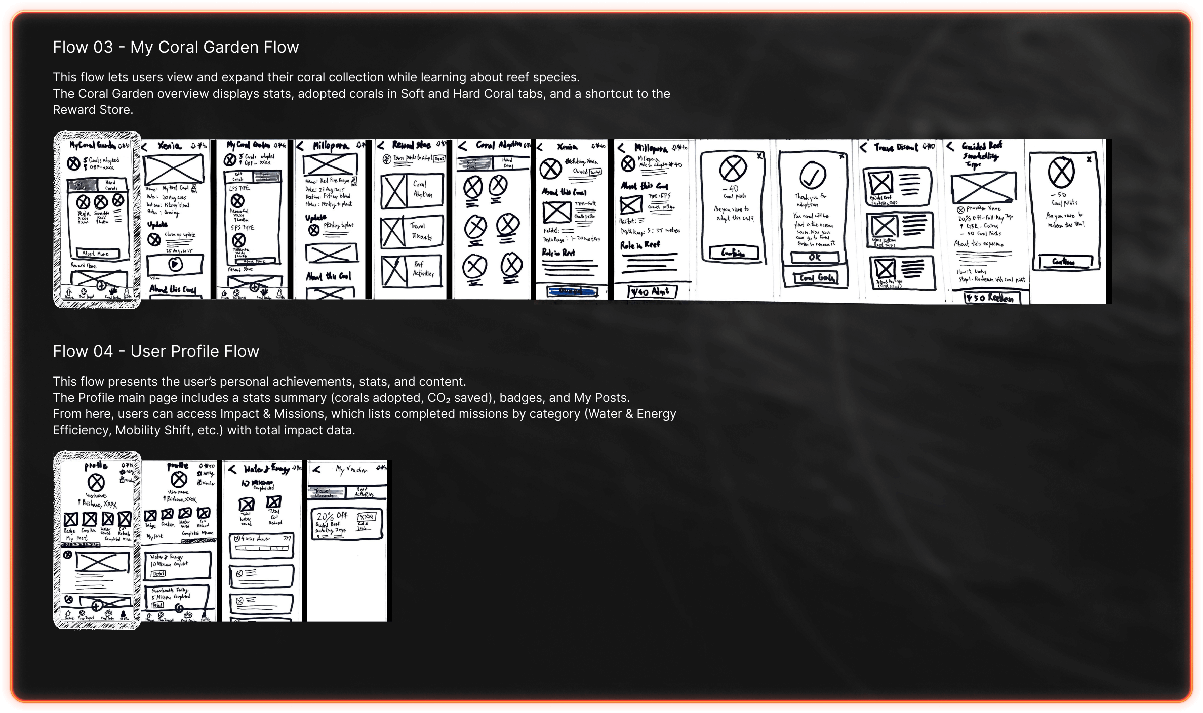
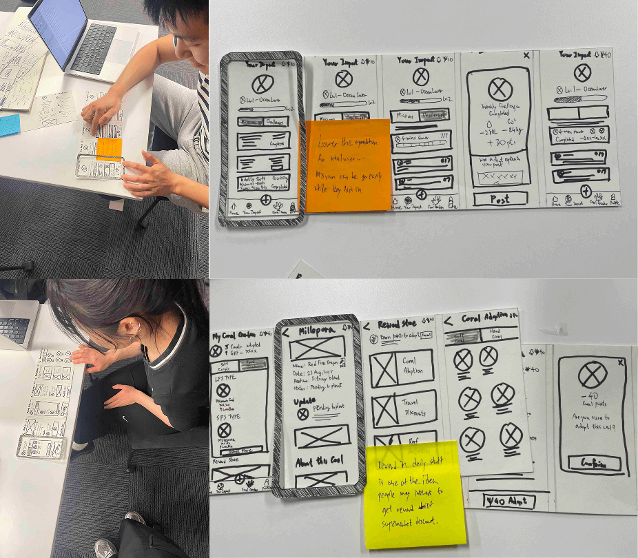
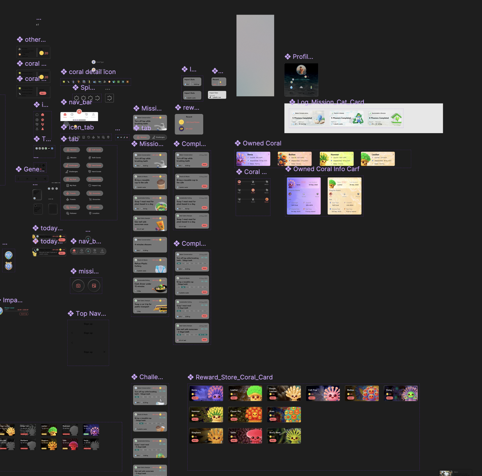
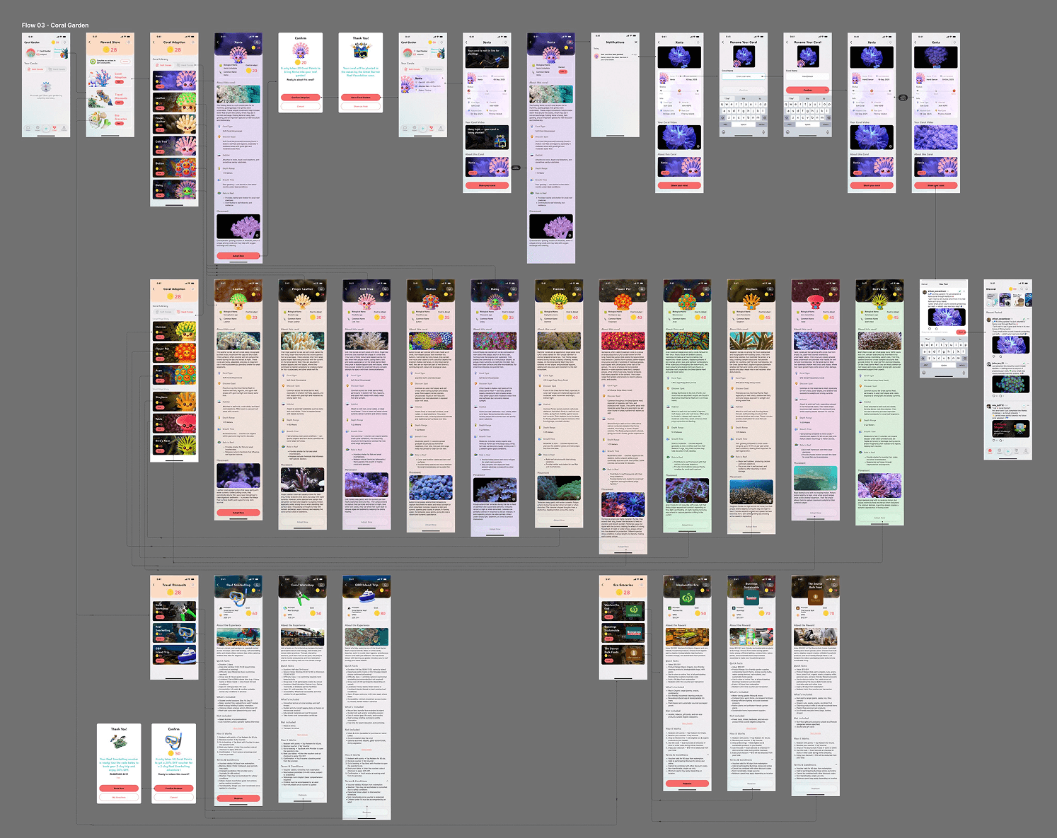
Ideations
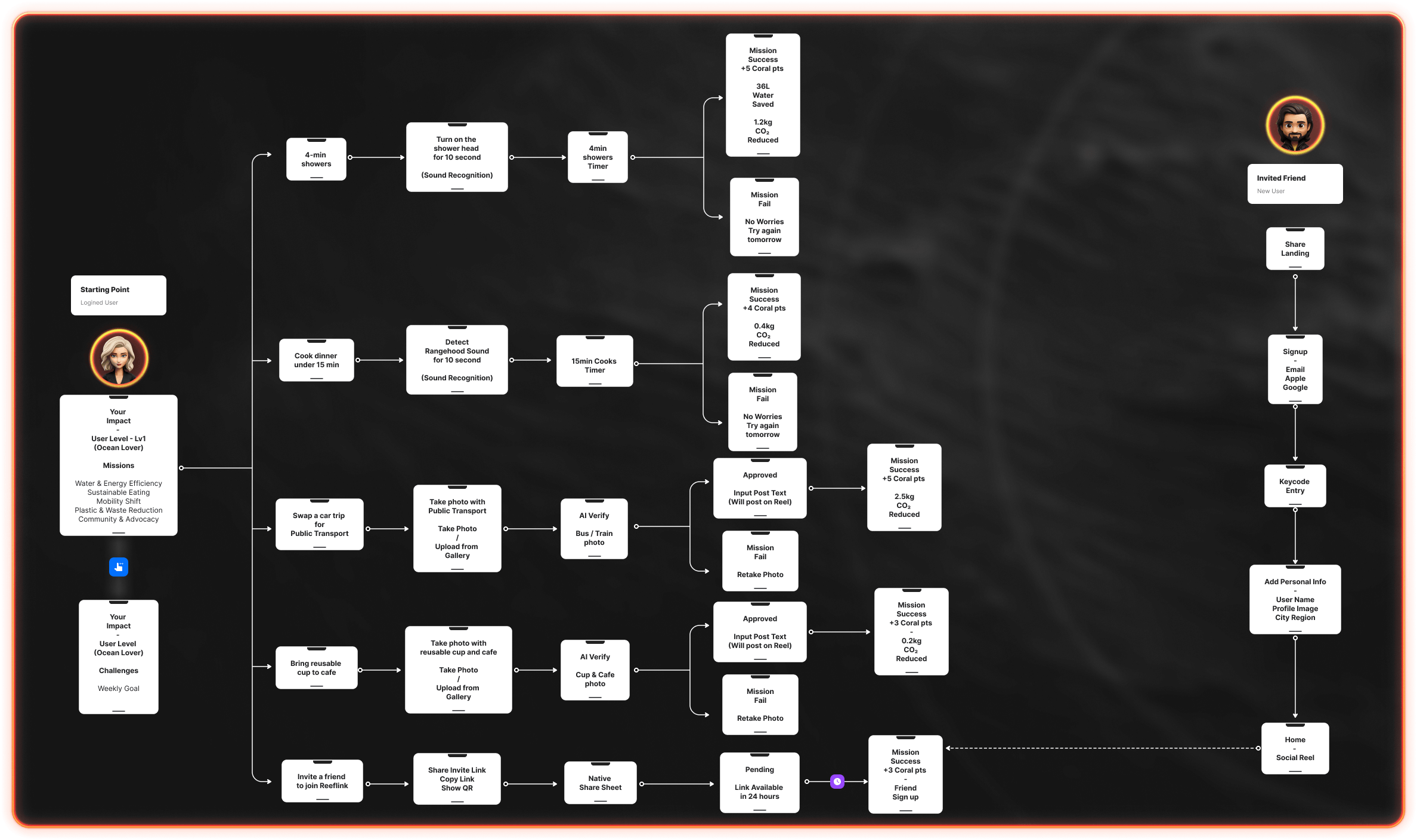
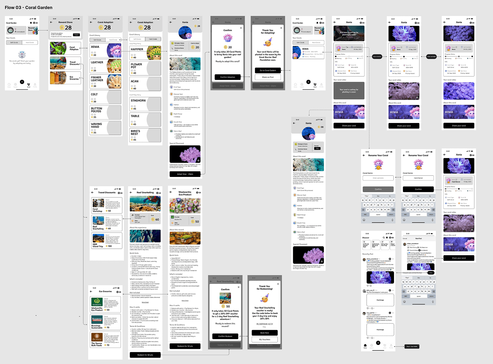
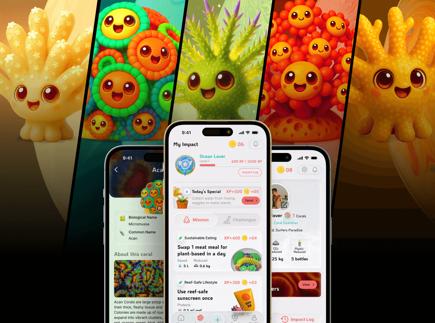
During ideation, I mapped out the core structure of ReefLink by designing a high-level application user flow. The experience is built around four main flows that capture the app’s essential functionality and engagement loop:
1: Onboarding & Home — introduces the mission of ReefLink and provides ongoing eco-action inspiration
2: Your Impact — Users complete eco-missions and earn Coral Points through real-world sustainable actions
3: Coral Garden — Users adopt corals and visually track their growth and health over time
4: Profile — personal achievements, progress history, and app settings

Design Output

Low-Fi Prototype
To quickly validate the core experience, I created a paper low-fidelity prototype of the main user flows. This allowed me to rapidly explore interaction layouts, test navigation logic, and iterate on key screens without heavy visual design. Building the prototype early helped me identify what information users needed most at each step before moving into wireframing.
Initial User Testing
I tested the paper prototype with target users to validate the mission flow and reward experience. Feedback highlighted two key improvements

1. Mission Design Considerations
Users preferred starting with simple, low-effort missions so they could quickly earn points and adopt their first coral. This helped reduce the barrier to engagement in the early experience.

2. Reward Categories
Participants felt that Travel Discounts and Reef Activities were too similar in value. They recommended adding more everyday reward options — such as supermarket discounts, food vouchers, or restaurant perks — to keep rewards practical and motivating.
Wireframes — Main User Flow
Following the paper prototype testing, I translated the core screens into mid-fidelity wireframes to refine layout, hierarchy, and interaction details. These wireframes represent all four primary flows of ReefLink, enabling clearer communication of the product vision and smoother transitions into high-fidelity design.The Coral Garden flow demonstrates how users manage their adopted corals and redeem rewards through the Reward Store. Users can view their coral collection, check adoption dates, monitor reef zones and growth status, and even rename their corals. The Reward Store provides three redemption paths: Coral Adoption, Travel Discounts, and Eco-Friendly Vouchers. Each flow guides users through confirming their use of Coral Points, receiving a voucher or booking code, and following instructions to redeem it with a provider.

Design System

Overview
Before developing the high-fidelity prototype, I established a cohesive design system to ensure visual consistency, accessibility, and strong brand identity across the ReefLink app. The design system includes typography, color foundations, component style, and the overall visual direction. This framework allowed faster iteration during UI development while maintaining a unified and polished user experience.
Typography
A dedicated typography structure was created to balance readability with personality.
KoHo is used as the display font for headings, page titles, and branding to give the interface a friendly and distinctive character.
Inter is used as the core UI font for all body text, forms, and interface elements to provide clarity and accessibility.

Type scales, weights, and spacing rules were defined for all text elements, ensuring consistency across different screen sizes and states.
Color
The ReefLink palette is inspired by coral reefs and ocean environments.
ReefLink Coral Pink is the primary brand accent used for key actions and highlights.
ReefLink Light Cyan acts as the secondary accent, providing contrast and reinforcing the marine theme.
Additional support colors help distinguish coral species and keep the interface visually engaging.

User Interface

High-Fidelity User Interface Design
Using the established design system, I developed high-fidelity screens to refine interaction details, enhance visual clarity, and bring the ReefLink experience to life. Each core flow — Onboarding & Home, Your Impact, Coral Garden, and Profile — was designed to feel intuitive, rewarding, and emotionally engaging.

User Testing

Methodology
To evaluate the usability and effectiveness of the high-fidelity prototype, I conducted user testing using two complementary methods:

The Think-Aloud Protocol and Task-Based Usability Testing combined with a SUS Survey. This mixed-method approach allowed both qualitative and quantitative insights into how users interacted with ReefLink’s core flows.
Overall Finding
Through the usability testing, I found that while users easily understood ReefLink’s mission and visual flow, they often struggled to connect how daily actions contributed to weekly challenges. A few participants were also confused by the XP and coral-point systems since they were not well defined, leading to confusion when redeeming rewards. In addition, the coral adoption prototype flow involved too many extra interaction by users that led to losing focus before the planted coral stage.
Promotion Video
Other Works