Overview
About
This UX design case study focuses on the e-commerce checkout flow enhancement for HomePlus. HomePlus was a Hong Kong-based e-commerce platform offering groceries, household goods, electronics, and more—aimed at delivering a seamless online shopping experience.
When I joined, the platform had only been live for about a year. As the checkout flow is critical to revenue, even small UX improvements could significantly boost conversions. The redesign was driven by customer service feedback and a review of usability issues in the existing flow, which revealed friction points that hindered user completion.
Project Objective
e-Commerce checkout flow is where the money is at. Any small design improvement in your checkout UX usually has a direct impact on how much money your site makes. The requirements start from customer service feedback, HOME+ existing checkout process with numerous non-humanity designs.
However, the development budget limits us only being available to adjust the front-end to solve the UX issues. To kick-start the revamp I start with market research to seek what kind of pain point we are currently facing.

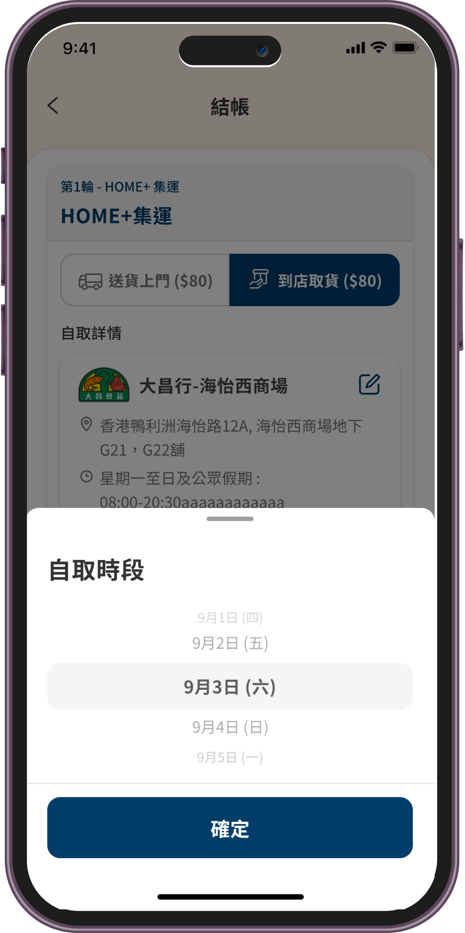
Painpoint 01
Too many delivery methods (Home Plus consolidation delivery, Merchant delivery, Instant delivery, Store pickup delivery, etc ). The reason is system and operation limitations.From the customer's point of view, they will face confusion with too many rounds of delivery.

Painpoint 02
The options of delivery or self-pick-up appear between the shopping cart and shipping step. Actually, this option should place in the shipping step inside with the delivery method.

Painpoint 03
In Home Plus APP, all the option selections applied internal-page selection handling. Users easily get frustrated feeling in this behavior.
It's because only facing the simple selection why switch the page?