HOME
HOME
ABOUT
ABOUT
WORKS
WORKS
CONTACT
CONTACT

GoGoYuedu App

"Any fool can know. The point is to understand"
2018 - 2019
Research
Competitor Analysis
User Research
Design
Wireframe
Prototype
Testing
Usability Test
Support
User Guideline

Overview

About
This UX design case study covers cross-platform application design (iOS & Android). The application was launched in 2019 on the Apple App Store and Google Play Store.

In the modern era, knowledge is present around us every day. Everyone ought to keep on acquiring new  knowledge, particularly in various facets of their professional lives. Discovery of various kinds of knowledge increases one's career worth. GoGoYuedu offers summaries of essential takeaways from popular books in various categories so users are able to learn knowledge more rapidly and effectively.  E-reading is not just a new concept in the market.

Before creating the experience, I had to conduct research and decide how to make the e-reading process improved.  One of my areas of focus for research was “Blinkist”, who offer some insights to improve the e-reading process. However, to get a better understanding, I conducted user interviews to understand the motivations and behavior of readers. Based on this research, I was able to create user personas, so we can select features that are most suitable for user needs.

Design Process

User Research
I conducted the user interviews with people who had a reading habit, but it was difficult to determine the reason behind their decisions during the process of reading according to the findings. I needed to balance my results, so I decided to interview people who lacked a reading habit.

Most interviewees who read frequently preferred non-fiction, and their book choice was not always driven by personal interest. Bookworms, reading a large amount of books annually, liked physical books over e-books. Ironically, they liked the process of reading better than the outcome. This lead to a conclusion that an e-reading product that learns rapidly might not be the best for this segment.

Conversely, discussing with non-readers allowed me to gather valuable pain points. Why aren't they reading? How do I get them to be interested in reading? A major issue that they complained of was time to read—many would prefer to be doing other activities with their free time than reading. Second, the physicality of books was also a problem with some because they complained that they were too heavy to carry around. These results indicated that non-readers might be a more suitable target market for an e-reading product that focuses on quick learning. Based on the user research, I created a persona to align with the target audience and presented it to stakeholders to gather feedback and ensure alignment on the project direction.
Base on user research build up User Persona

Ideation

Content is the most valuable part of this project, and we need to make it stand out. From our interviews, we gained a clearer understanding of three major user needs for an e-reading product:

01 . Efficient Learning – Users wanted to catch up on the latest knowledge within a limited time.

02 . Flexible Reading – Users sought alternative ways to complete a book, moving beyond
traditional reading methods.

03 . Recommendations – Users wanted the product to help them discover and recommend unexpected knowledge.

01 . Estimated Reading

Provides users with an insight into how long it will take to finish a book.

02 . Audio Player

Allows users to listen to the content instead of reading.

03 . Freebie Book

Enables users to read a limited number of books within a specific period.

Design Output

User Flow & Wireframe
Before designing the app layouts, I need to establish the user flow. Based on discussions with the business owner, I agreed to implement a subscription model. The key question is: How do we encourage users to subscribe? One approach is integrating a freebie book section into the product. If users are hesitant to pay upfront, we can offer a free trial and a basic membership, allowing them to read one freebie book per week. Providing free content is crucial for keeping users engaged and increasing retention.
The application is divided into three different user types: Visitor, Free Member, and Premium Member. Based on these user types, I created different user flow cases to ensure alignment with the developer and business owner. This helped clarify how each user type interacts with the product and ensured a seamless experience across different access levels.
Netflix's subscription flow was one of the research examples I analyzed. It provided valuable insights to create engaging user journey.
To design user flow we need to present it as above, to align the idea with developer & business owner.
Wireframe
Fonts & Color
Once all parties agreed on the user flow, I moved on to the UI design phase.The first step was to define the color scheme and icon style, then transform the wireframes into detailed UI designs for stakeholder approval. 
At the same time, I worked closely with the development team to ensure the backend CMS system aligned with the design output, making sure everything was functional and implementable.

Primary color #88BBD6

Secondary color #111325

Secondary color #EEF7FE

Icons Design
User Interface Design

Onboard Flow

The onboarding flow helps users quickly understand the app’s key features and the type of content it offers.

Landing

The weekly freebie book is the main highlight on the landing screen, designed to immediately capture user attention. Key content such as the category menu and new arrivals are also prominently featured to encourage exploration.

Cover

Each book’s read points include a brief summary and recommendations on who the book is suitable for, helping users quickly decide if it aligns with their interests or goals.

Chapter

The chapter pages are designed for a smooth reading experience, with features that allow users to adjust font size and switch between chapters easily.

Subscription

Major platforms like Netflix, Apple, and Spotify successfully use subscription models to deliver content. I applied this concept in the UX design to help stakeholders understand its business value.

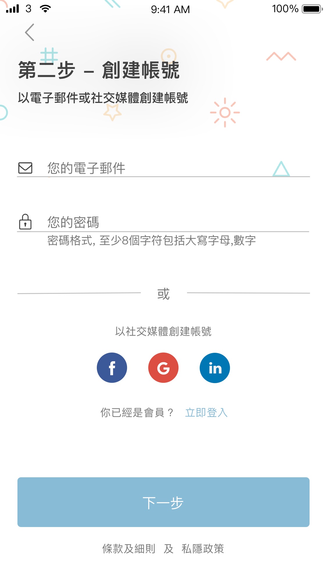
Create account

I designed a user flow that starts with plan selection and ends with account sign-up. While some apps invert this flow, I proposed letting users explore and sample content first, empowering them to decide whether to sign up.

Select interest

At the final sign up step select interest tags users select directly influence the content displayed in the freebie book section, allowing for a more personalized and interactive experience.

Audio

In addition to reading, the app offers audio versions of the read points, catering to users who prefer listening over reading—especially at the start of their journey.

My desk

The Reading Desk displays all the books a user is currently reading. Users can also reset finished books to “unread” if they want to revisit the content.

User info

The app also allows users to update their subscription plan, personal information, and password easily within the account settings.
Prototype
Before development began. We needed to create a full prototype for review and finalizing the user flow. A prototype is the best way to communicate design concepts with the development team and stakeholders.I used Sketch + InVision to build the prototype and test our initial concepts, ensuring they worked effectively with real content.
(Looking back at 2019, Sketch and InVision were widely used for prototyping. However, InVision shut down in 2024.)
Other Works