HOME
HOME
ABOUT
ABOUT
WORKS
WORKS
CONTACT
CONTACT

SmarTone Fibre Broadband

“From Frustration to Flow”
2019 - 2021
Research
Competitor Analysis
Data Analysis
User Research
Design
Wireframe
Prototype
Responsive Design
Testing
User Acceptance 
Testing
Support
This is some text inside of a div block.

Overview

About
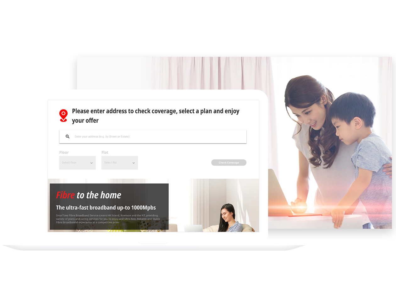
This UX design case study focuses on the website revamp and subscription flow enhancement for SmarTone. The revamped website was launched in mid-2020 on the SmarTone website:SmarTone Fibre Broadband.


SmarTone Telecommunications, founded in 1992, is a leading Hong Kong-based provider of voice, multimedia, mobile, and fiber broadband services. The SmarTone Fibre Broadband revamp aimed to increase subscribers from one to three per household. My role was to identify pain points, streamline the subscription process, and improve conversion rates.

Design Process

User Research
I conducted user interviews using the “Lookback” digital tool, which allowed me to monitor how users interacted with the broadband website upon their first visit. Based on the "Lookback" results, users spent substantial time on the home page, struggling to understand the  journey. Many were unsure how to use the address search bar, and some found the content unclear and had difficulty locating relevant information.
Data Analysis
I analyzed Google Analytics funnel data to identify key drop-off points in the user journey, helping to pinpoint which steps needed the most improvement.After studying data from different periods we realized that the drop-off rate from the registration step to the review step was about 90%.

Additionally, the drop-off rate from the address search to the plan selection step was over 35%.

Upon reviewing the user flow, I identify one of the key reasons for the high drop-off rate — Users were required to enter their mobile number for OTP verification before they could enter their registration details. This step was creating friction and needed to be addressed in the revamp.
-90%.
Registration to Review step
-35%.
Address Search to Plan Selection Step
Summary & Suggestion
01 . Enhance the Address Search Bar Experience
02 . Restructure Landing Page Content
03 . Balance Business and User Requirements
04.  Reconsider the OTP Proces
05 . Redesign of Plan Card 

06 . Enhance the Plan Summary Card
Ideation
To improve the overall user journey, the ideation focused on enhancing key touchpoints—address search, landing content, OTP flow, and plan presentation while balancing user needs with business goals.

01 . Enhance the Address Search

The existing address search required users to input their full address, with multiple trigger points that often led to confusion. To improve on it, I redesigned the search process into a step-by-step process to avoid errors and make the process easy.

02. Identify Customer Type

The OTP process was used to identify customer types, but it created a major roadblock for users. To resolve this, I introduced a background identification procedure . Now, both new and existing customers enter their mobile number with personal details. The system checks in the back end and without interruption.


03. Plan Summary Card

One of the key business values is the inclusion of add-on optional services, which can make pricing unclear throughout the subscription process. To address this, a summary card was employed to clearly display the price breakdown and include a traceback function from the registration to the review stage.

Design Output

User Flow & Wireframe
After presenting my ideas to the product owner, I began the website design process by mapping out the user flow and wireframes. Using the existing information architecture, I broke down the journey into separate flows based on funnel steps and user roles. 


The main funnel included:
1. Check Coverage
2. Plan Selection
3. Personal Info & Review


Each step was carefully designed with responsive considerations for both desktop and mobile.
Wireframe and flowchart to present the whole user journey. Starting from landing page trigger different enter points to address coverage search. Also the plan & add-on service selection etc
Wireframe and flowchart of Plan Selection - Mobile
User Interface & Prototype
Once all parties agreed on the user flow, I moved on to refine the UI design & prototype phase. At the same time, I prepared an animated explanation flowchart to help developers gain a clear understanding of how the UI interactions would be presented to users.


Before development began, I needed to create a full prototype for review and to finalize the user flow. Moreover, once the prototype received final approval from all parties, the website could officially move into the development phase. During development, I maintained constant communication with the developers to address any difficulties they faced with the user flow and to ensure they fully understood all the details. Finally, the revamped website was launched in June 2020.
(Looking back at 2019, Sketch and InVision were widely used for prototyping. However, InVision shut down in 2024.)
Feel free to explore the live website to experience the full web solution. SmarTone Fibre Broadband.

Improvements
Based on Google Analytics funnel data, I measured the performance before and after the website revamp.
  • Overall conversion rate improved by over 0.5% post-revamp.
  • From "Personal Info" to "Review" with a 9% drop-off improvement.
  • From "Review" to "Thank You", the drop-off improved by over 23%, showing significant gains in the final stages of the funnel.
30%
Conversion Rate Increase 
1.66% → 2.28%
However, not all steps outperformed the previous version. I observed that over 72% of users dropped off between "Plan Selection" and "Personal Info". This led me to investigate further.
  • The increased number of optional add-ons in the "Offer & Add-on" section might have overwhelmed users.
  • The horizontal plan card layout created excessive white space, potentially reducing visibility and causing confusion.
After internal discussions, all parties agreed to re-enter the UX problem-solving loop—redefining issues, validating hypotheses, and iterating post-launch to continuously optimize the user experience based on updated data.
Other Works