Research and Findings
GA Report - Left Menu
Top Function
Base on the data research, in the top ten functions half of the functions are relative to user mobile plans services.
"Usage", "Member", "Bill", "My Mobile Plan" and "Message"
"Offer", "Shop", "Livechat", "Service Plan
GA Report - Right Nav Bar Function
Right Nav bar function
Before 25th May the store icon display on "Three icons menu with 2.16% Member in "card" icon display on top right nav bar with 8.59%
After 26th May the store icon display on top right nav bar with 0.96%Member in "SmarTone Plus" icon display on "Three icons menu with 8.50%
Finding
By the usage of function "Member" with stable usage not much different
Suggestion - Affect "Memeber" performance one of the factor is the icon presentation, before 25/05 using a card icon to represent 'member' is bit better than user "ST Plus" so we suggest adjusting the member to the "card icon.
GA Report - Function Usage
Shop Function
Research by data "Shop" function usage with 9.33%
If use this to direct user to Web view online store would not be a good experience so base on Left Menu GA Report, we suggest to break down "Shop" in to a section
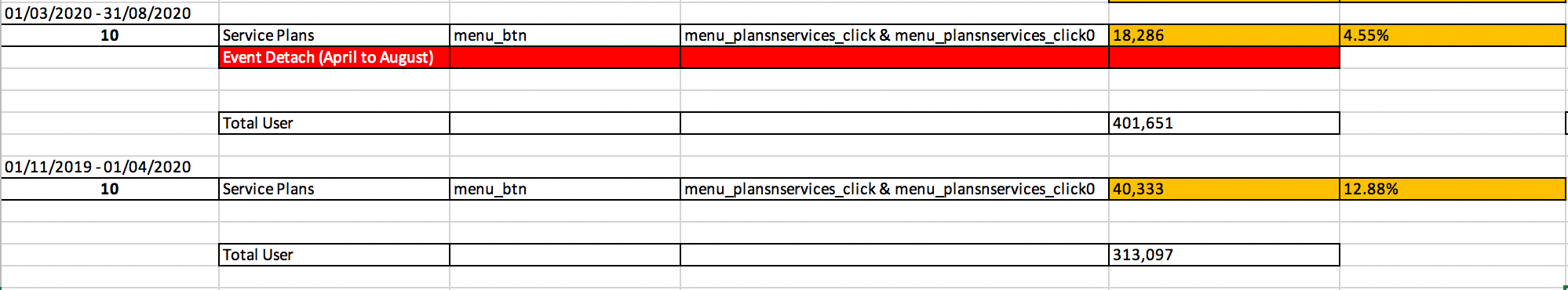
Service Plan Function
By the usage of function "Member" with stable usage not much Because of the event detach from April to August. Found out other date range for compare. Result show "Service Plans" with around 13.11% usage.
Finding
Base on the data result, Shop & Service Plan with at least 10% user usage these two functions. So we suggest presenting these value functions in a larger section in the new home landing.
Survey and Interview
19 Respondents. from Different Telecom Smartone, 1010, CSL, 3, CMHK, Birde etc.
What function they will use on the telecom application?

Unlimited Data Plan
11 Respondents
Redeem membership offer -10 (90.9%)
Check offers - 8 (72.7%)
Check Bill - 8 (72.7%)
Active/ Check Roaming Plan - 4 (36.3%)
Go to Online Shop - 2 (18.1%)
Key User Feedback
They download the apps to checking their loyalty points and redeem the prize
They don't download the telecom app because they no need to worry about overused the data.
They don't download the telecom app because telecom also will send SMS and bill QR code for them to pay the bill
They check the bill because they found out the bank statement cost different from their plan price
They feel lost while they click content's links which redirect to the other web view
Limited Data Plan User
8 Respondents
Check Data Usage -8 (100%)
Check Bill - 7 (87.5%)
Redeem membership offer -5 (62.5%)
Check My Mobile Plan -3 (37.5%)
Check offers - 3 (37.5%)
Key User Feedback
They download the apps mainly to checking their
data usage
They download the apps because telecom sales
asked them to download it for a discount offer
They download the apps because it is convenient and
time-saving compared with call the CS hotline and walk-in
They don't download the apps because there are too many promotions which they are not attractive and useless. They no need an app for promotion and it is waste their phone memory usage